Last week, in an unlikely, last-minute burst of productivity, we opened a new special exhibition at the ACM.
It was an exhibition the likes of which was unprecedented. I must say I’ve been supremely pleased with it.
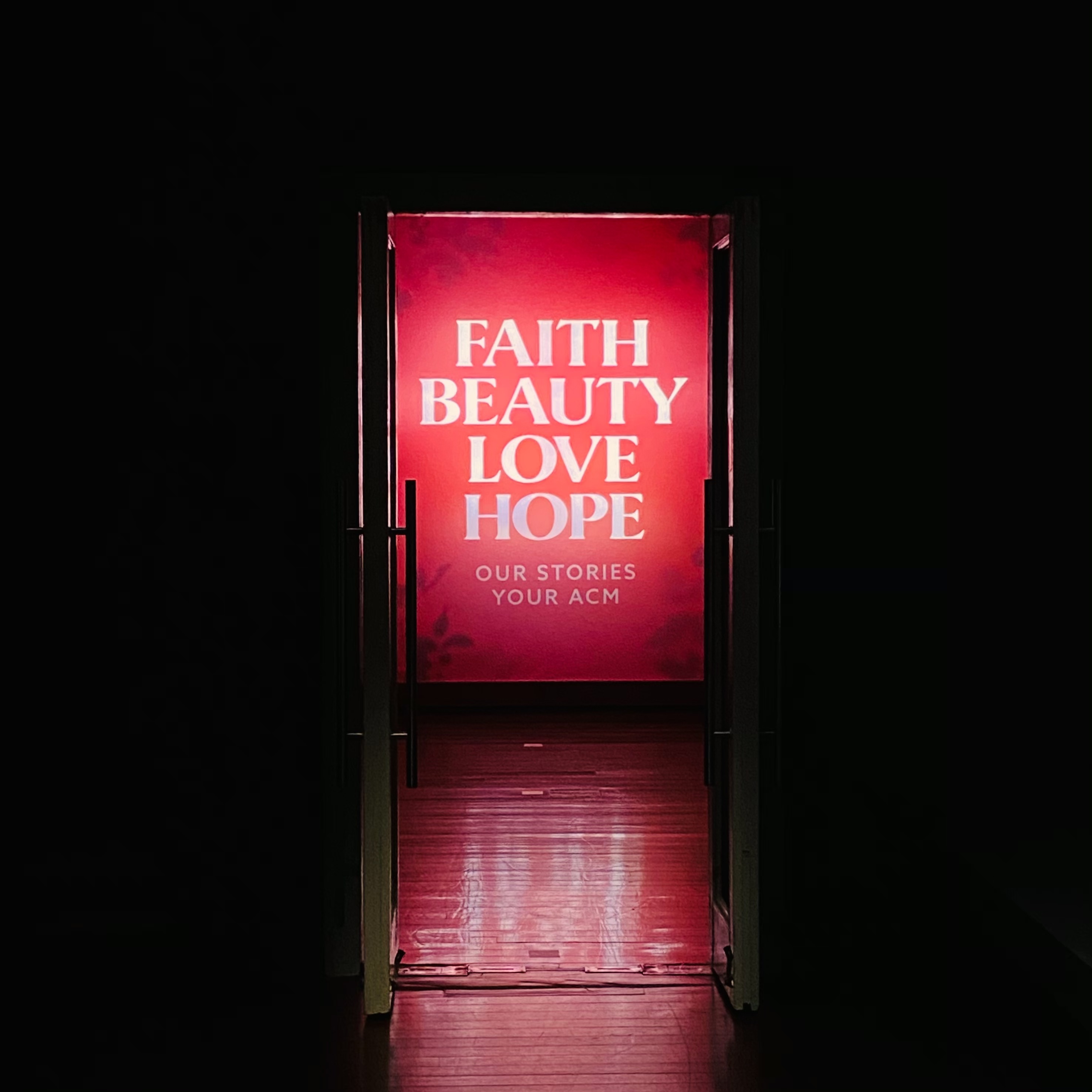
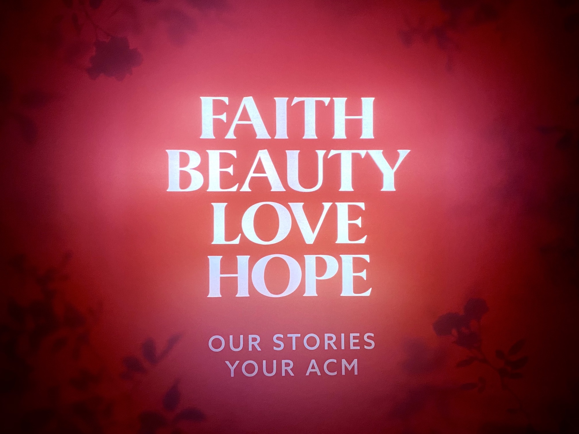
The title of the exhibition is FAITH BEAUTY LOVE HOPE – OUR STORIES, YOUR ACM.
The exhibition is essentially a “Best of ACM” exhibition. It features some 60 masterpieces from our permanent collection, quite a few never before displayed, many taken out from our permanent galleries.
What is radically different about this exhibition, is how the exhibition is curated, or rather, “etaruced” (being a subversion, or flipping-around of c-u-r-a-t-e).
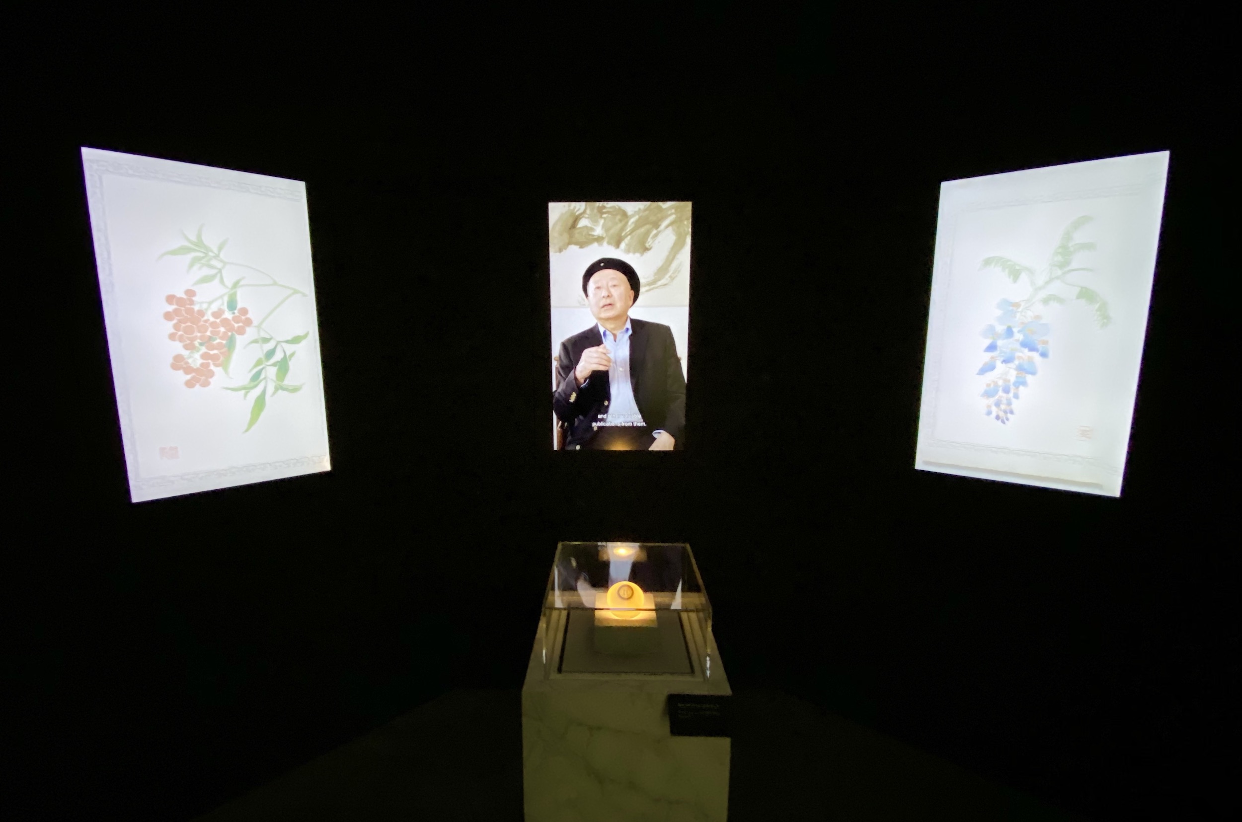
Each and every piece has been hand-picked by individuals across all departments – not only curatorial but security, estates, programmes, marketing, etc – at the museum, and also representing different partners and supporters of the museum.
[So the exhibition is not just a showcase of treasures in our collection, but also a showcase of the many communities of professionals and volunteers who work, behind-the-scenes, to keep the museum going.]
The “etarucial” captions the visitor would read on the exhibition panels are individual reflections as to how and why the piece picked has resonated strongly with the individual who picked it.
These reflections are personal and emotive – they are variously suffused with grief, anger, confusion, frustration, yearning, faith (in the divine), love, hopefulness and joy. They are small windows into the wide array of emotions – and challenges – my colleagues have individually faced this year, even as we’ve all been collectively battling the pandemic.
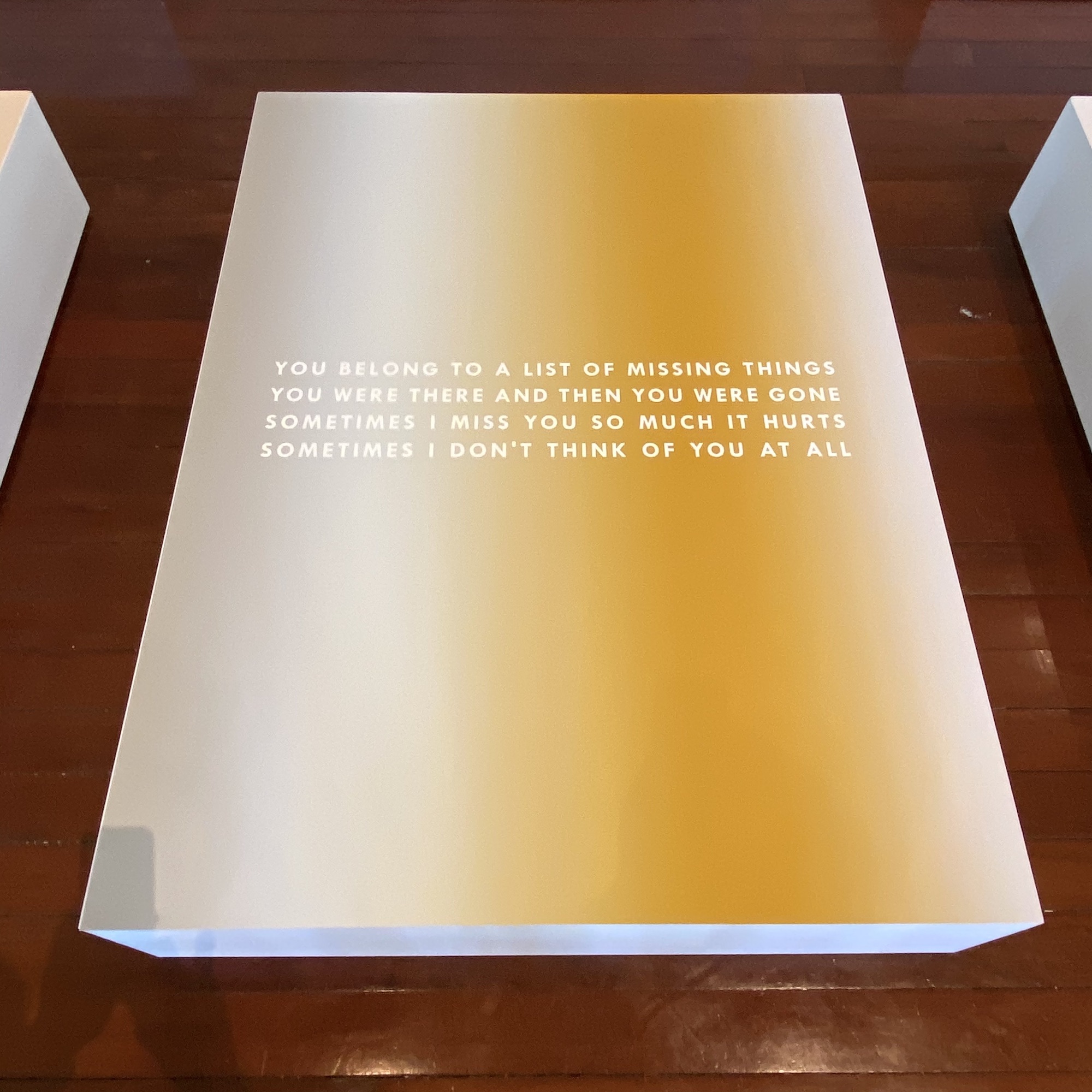
I got to pick a piece too – see below.
In my “etarucial” text, I shared how I had had my heart broken multiple times, including literally, in the past year and half; and how it had been extremely difficult for me this year, balancing heartbreak and leading the museum as it is forced to adapt to a new normal.
The exhibition has been curated, only insofar as our brilliant curator has arranged the magnificent pieces in an order that makes sense visually and aesthetically, and calculated to deliver multiple emotional sucker-punches to the unsuspecting visitor.
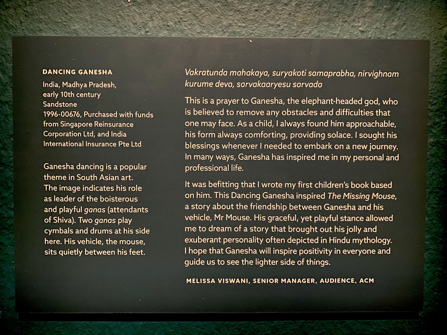
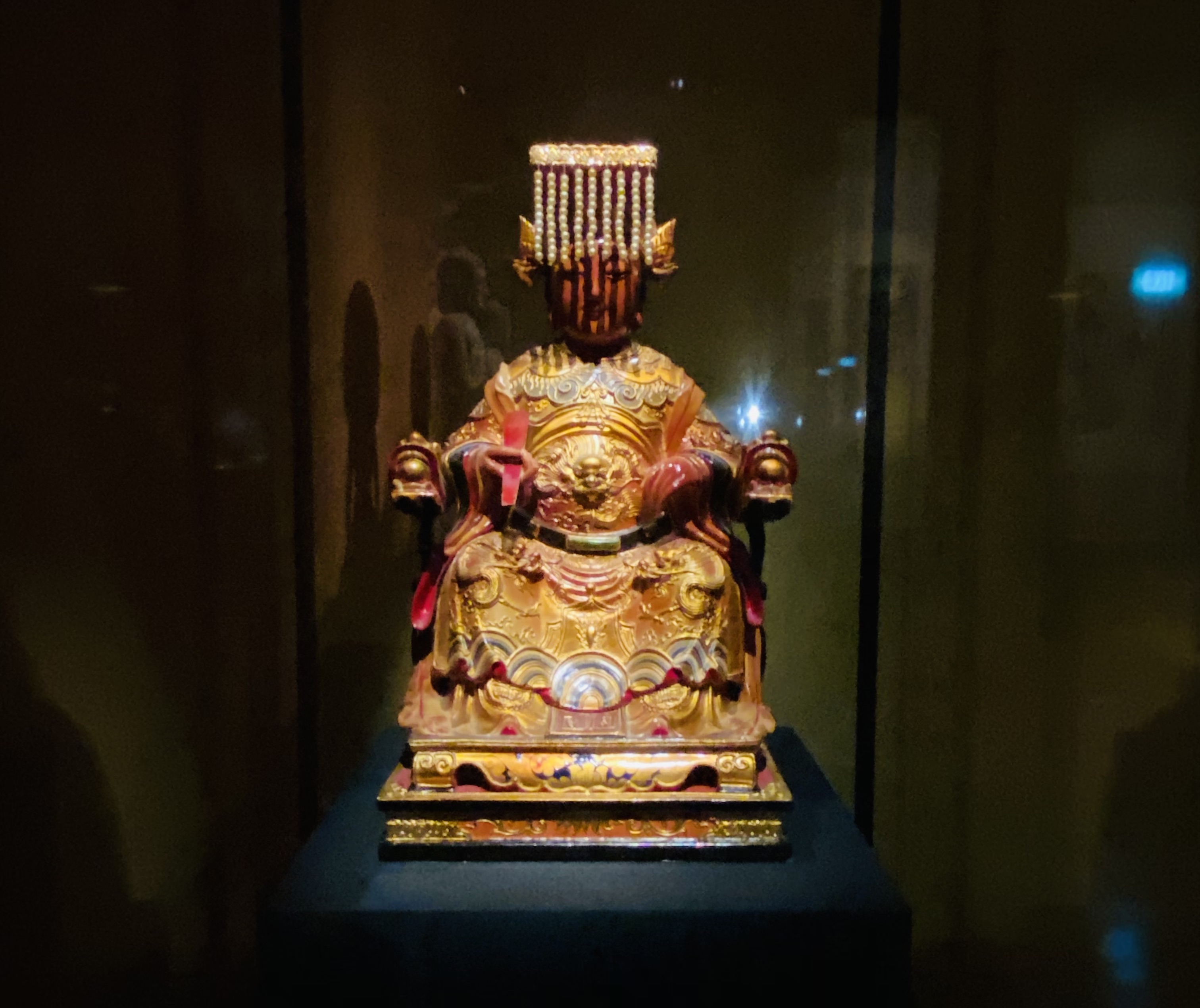
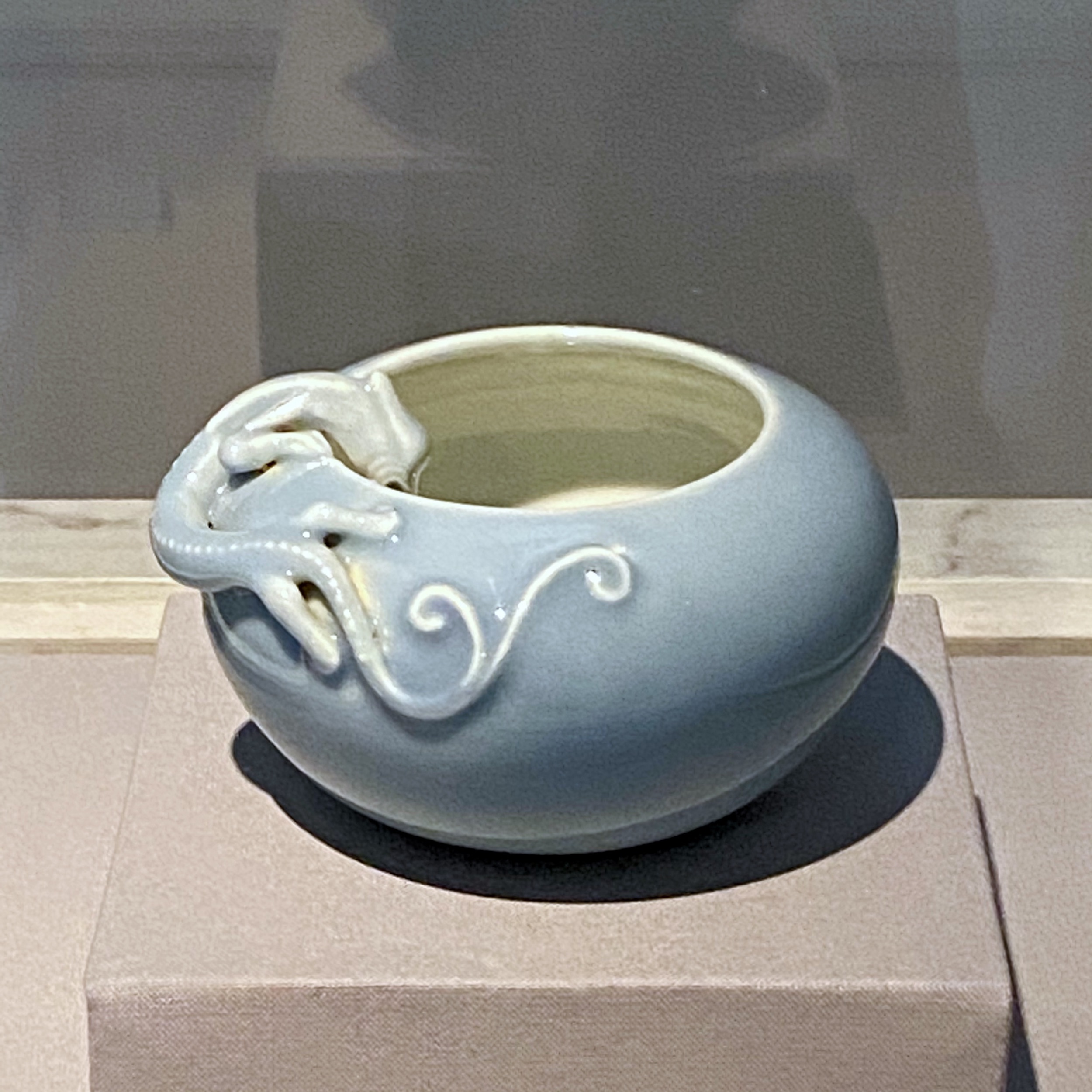
Whenever I’ve felt particularly down this year, I’ve made a ‘pilgrimage’ of sorts to this piece to find peace. It is luminous and exquisite in its simplicity, evoking the moon rising high above the horizon, bestowing soft light upon the world. The piece represents love. I’m reminded of the legendary lovers Chang’e and Hou Yi. It also represents hope – that all of us (including me) will prevail over everything, just as we have before, and in so doing, find inspiration to create new beauty.”
KENNIE TING, DIRECTOR, ACM
* * *
You see, we were meant to have opened a blockbuster exhibition in May 2020, in collaboration with the Palace Museum in Beijing, and featuring the story of two Emperors of China’s Ming Dynasty – the Emperor Yongle and the Emperor Wanli.
I had even coined a bombastic, over-the-top title calculated to tap into the post-GAME-OF-THRONES+YANXI-PALACE zeitgeist.
[YONGLE – WANLI: EMPERORS OF THE MING. Cue throbbing, pulsing, drum-heavy theme music.]
But after multiple delays due to COVID, it became clear by late September that the exhibition wouldn’t happen at all. It has since been postponed till late next year.
Our next special exhibition not being till April 2021, we needed to “bust out” a special exhibition in record time, in order for us not to lose the momentum we had built up with our visitors in the course of 2019.
We had only two months to do it, since I wanted an exhibition that would close 2020 and open 2021.
I wanted an exhibition that was reflective, but also celebratory and hopeful in tone.
I felt there was so much to celebrate – us all being safe and healthy in Singapore; us all having almost gotten through A.H. (as in, Annus Horribilis) 2020; and of course our facing the possibility of a vaccine being widely available in the near future…

The idea to do an ACM Treasures exhibition featuring both collection and the people behind the museum, came from our Head of Curatorial.
It was essentially Curatorial ceding curatorial – something I felt was very subversive for Curatorial to propose.
“Gosh, that’s very subversive,” I told my Head of Curatorial during our Senior Team Meeting.
Pregnant and uncomfortable silence, as the collective wheels turned…
“I LOVE IT! LET’S DO IT!!” I blurted out.
Collective gasps and sighs of relief.


* * *
As Director, I have the final say over the title of any exhibition we put on.
Yes, there is always the insistent counter-proposal. It’s most annoying. But I generally win, because I’m very good at i) playing the petulant child, and ii) putting my pretty foot down – no offense to my BRILLIANT, BRILLIANT team!!
The working title for the exhibition had been “ACM TREASURES”.
And the proposed ACTUAL title for the exhibition… well, it was “TREASURES OF THE ACM”.
I was, like… HELL, NO!! What are we, in the ‘90s????
A title like “ACM TREASURES” would have taken us ten steps back where I’ve worked to the bone these last four years to take us five steps forward!

“WHO in the WORLD is going to come see a show titled ACM TREASURES?” I told my Head of Marketing and PR.
“But…” came the beleaguered reply.
“The word TREASURES is henceforth VETO-ed!” I added with a dramatic flourish, fingers diva-snapping.
“Yes… but you see…”
“Do you not understand,” I interjected before he got too far, “That we need a title that is not like any title we’ve ever had before; that tells the public CLEARLY this IS NOT THE USUAL ACM exhibition. That this is something very very different! We need a title that would be radically, subversively, existentially different, even as it represented ACM and was ACM to the very very core!”
I lectured on as my long-suffering – but really really extremely brilliant – Head of Marketing and PR nodded wistfully and in resignation.
“We shall call it FAITH BEAUTY LOVE HOPE – OUR STORIES, YOUR ACM,” I declared imperiously, my hand raised talk-to-the-hand-like.
There was one further, feeble attempt at a counter-title…
“Yeah, we’re going with FAITH BEAUTY LOVE HOPE. Thanks very much,” I repeated, in a firm you-can-say-whatever-you-like-but-I’ve-decided-thank-you-and-don’t-forget-I’m-the-director-so-I-get-to-decide tone.

I mean…
I thought it was a very snappy and catchy title.
It was a totally un-ACM; an un-Museum-like title. It would be a title NO ONE would expect from a museum.
I mean… who in their right mind (in Singapore) would title a museum exhibition, FAITH BEAUTY LOVE HOPE?
It sounds more like the name of a perfume.
[FAITH BEAUTY LOVE HOPE…. The new fragrance, by CHANEL…].
Yes indeed, I thought the title beautifully subversive.
And yet it was also completely relevant to / resonant with the times.
Jokes aside, the four words – FAITH, BEAUTY, LOVE and HOPE – meant something. They weren’t just pulled out of nowhere.
These words got to the heart and soul of the exhibition – they were the universal essences the exhibition hoped to invoke, evoke, and celebrate.
FAITH, BEAUTY, LOVE, HOPE represents what all of us most need right now…
FAITH in the world and in something bigger than ourselves, perhaps something divine; BEAUTY to nourish the soul; LOVE to heal the heart; and above all, HOPE to light our way.
[At this point, and at risk of undermining the dramatic build-up of the narrative, I feel I must divulge that in coining the title for the exhibition, I was (rather subversively) inspired by the 2001 movie, MOULIN ROUGE and its manifesto, TRUTH BEAUTY FREEDOM LOVE. 😂
The abbreviation for the title of the exhibition – FBLH – is also a subtle play on LVMH. Yes, indeed, I wanted the exhibition to evoke a movie and/or a 5th Avenue shopfront window – to be an otherworldly, aspirational, emotive cinematic experience, in other words.
After all, I’m ALWAYS being nagged at (by folks who know very little what they mean) about how exhibitions need to be more “immersive and experiential”.
So I gotta give ‘em what they want, right? (Cue diabolical giggle…)]

* * *
Another point of great pride for me is thus the ravishing exhibition design.
Yes, I can confidently say by this point that ACM has, in the last couple of years during my tenure, built up a reputation for gorgeous, rapturous, immersive and experiential – there the words are again! – exhibition design.
This is due, in very large part, to my being excessively, unstintingly, unreasonably, unrelentingly, immovably, inhumanly, obsessive-compulsively, particular about DESIGN.
My colleagues would tell you how I am wont to stomp and trample about the galleries mid-installation, terrorising curators and designers alike with my shrieks of “WHERE IS MY SIGHTLINE?!! WHERE IS IT???!!! I NEED A SIGHTLINE HERE!!”
I mean… you must agree with me that sightlines are EVERYTHING.

For each and every exhibition at the museum, I demand that ACM articulate (to our designers) a unique design brief, that involves the spelling-out of 3 to 4 specific essences that the design needs to encapsulate, including an overall mood the exhibition needs to evoke.
I also demand that no individual exhibition at ACM ever looks like any other exhibition anywhere on earth, and definitely not like any other past ACM exhibition.
The initial design brief for FBLH took place just a few days before I was called into the clinic by my cardiologist to be told my heart had to be stented.
At the time, my brief for the designers was that the exhibition design needed to play on the ACM brand colours of red and white; it needed to be “cinematic” and the exhibition had to feel “heartachingly beautiful” overall.
Not just beautiful, mind you. Heart-achingly beautiful.
The designers reverted in record time, barely two weeks later. [We really have excellent exhibition designers in Singapore!]
The presentation of their almost-final design was made to me just a few days before I was due to go the hospital for my stent; and a few days after I had had to manage a PR crisis at the museum. In the midst of preparing for my operation – and in particular, having a minor panic attack because I didn’t know if I had medical insurance [turns out I did] – I had to be trotted out to pacify furious members of the public.
I thought I would die of a heart attack.
So when I saw the rendering of the first sightline into the Special Exhibitions Gallery (see above), I burst into tears.
For the duration of the presentation, I was visibly emotional. I couldn’t stop crying. The design was so beautiful.
The designers totally freaked out. My team was petrified. I could see the wheels turning in their heads – oh dear, what’s wrong? What’s Kennie on to now??? (cue anguished inner howl).
Someone decided to asked me if there was anything the matter.
I replied that I was crying because the design was “TRULY heart-achingly beautiful” and that “I have just gone through a particularly difficult week, and seeing how gorgeous this design is, has truly shattered me. SHATTERED me, you hear. I want to CONGRATULATE everyone for this really EXCEPTIONAL design. It’s JUST GORGEOUS.”
The designers were so pleased.
They wrote separately to me to thank me for my support. It was only then that I told them about my heart condition.

* * *
Said condition having been revealed to me only after I had coined the title of the exhibition, the latter, and the exhibition itself, thus took on a greater resonance for me personally.
Because it seemed to me that it had taken an inordinate amount of FAITH, BEAUTY, LOVE and HOPE, for me to keep going.
FAITH in Singapore’s healthcare system – which is excellent; and in the assembly of god/desses, ancestors, spirits and energies at ACM, to whom I had always accorded the greatest respect and reverence.
BEAUTY, as embodied in the museum’s collection – and particularly in the piece I picked. Beauty that has afforded me great solace this year as I struggled to process escalating bad news on the personal front. [I’ve characterised 2020 as a game of “Setback Dominos”.]
LOVE from my friends and my colleagues, but also from my family members – my brother, sister-in-law and my cousins. Love that has served as fuel, keeping my heart warm and full even as it was broken to pieces inside.
HOPE, because the fact is I could have died suddenly next year. And this timely intervention brings new hope, new life – at least two more decades, if not three? – for which I am so grateful.

Yes, I am grateful. So grateful that my condition was caught early. I read this as divine intervention – as the god/desses, ancestors, spirits and energies at ACM looking favourably upon me.
There was no reason, really, why this year should’ve been the year I decided to go for a full medical check-up, and actually take it seriously; actually follow-through on the diagnosis.
So I am thankful to the ACM god/desses, ancestors, spirits and energies for their protection.


* * *
On the opening day of FBLH, I welcomed VIP guests through the exhibition.
[Note that there were three exhibitions launched that day – a contemporary art installation by Singaporean artist Dawn Ng, entitled PERFECT STRANGER, and a contemporary take on calligraphy and connoisseurship called thINK (read: “think ink”). I can’t do justice to these excellent exhibitions in my main text but I do highlight them in the ensuing photographs.]
That day, I floated through the special exhibition gallery like a sprite, flitting in and out of the shadows and light, saying hello to whoever I managed to see that morning.
It was very edifying to observe my guests’ reactions to the exhibition. For starters, there was unanimous praise.
Quite a few guests waxed lyrical and at length about how the exhibition was exactly what the world needed now.
Many gushed at just how gorgeous the exhibition design was, with spectacular sightlines everywhere you looked; and how what was brilliant about it was that it was still, at the core, an exhibition that showed the richness and magnificence of ACM’s collection.
Yet others commented that the curatorial (“etarucial”) concept spotlighting personal voices was such a meaningful touch.
“Thank you, thank you, thank you so much – the team worked so hard for this.” I invariably replied, bowing deeply and sincerely. 🙏🏻
I thought I’d be able to stay all day.
But, exhausted from being on my feet all morning, and knowing now to listen to my body when it tells me I need rest, I took my leave and went home.
Not before congratulating my team again, for the job exceptionally well-done.

* * *
Far from being just an exhibition title, FAITH BEAUTY LOVE HOPE has become a sort of Manifesto for me.
On the museum front, long after the exhibition ends, these four essences will continue to undergird everything we do.
Certainly, ACM being a museum of antiquities and decorative art – with a large chunk of our collection being works of religious art – FAITH, BEAUTY, LOVE and HOPE have always been expressed in our displays and exhibitions.
However, in giving voice to these essences so explicitly this time round, we are laying bare our motivations, staking our claim to fame, as it were.
In the year ahead and even beyond, the visitor can expect more FAITH, BEAUTY, LOVE and HOPE from the ACM. We will do our utmost to have the museum be a space of inspiration (divine or otherwise), beauty, rapture, comfort, celebration and hope to all who step through our doors.
That is true meaning and impact.


* * *
2021 shall also see FAITH, BEAUTY, LOVE and HOPE circumscribing a sort of blueprint on the personal front.
Here are the guiding principles for me this year:
Have FAITH in the bigger plan the Universe has for me. And relax.
Instigate subversive BEAUTY all around me. In other words, don’t change.
AccePPt LOVE when it comes. It’s time.
HOPE for the best. Which is not hard, since I’m a cup-half-full sort of guy.
Whatever life/one may throw at me, I always get the hell back up, put on the suit – or gorgeous, tongue-in-cheek kurta designed by hipster couturier in Delhi, paired, in flagrant disregard of Partition, with hand-embroidered kurta made-and-designed in Lahore, such as that I wore to the opening of FBLH… – slip on shoes, flowers and smile, and make my dramatic entrance.
All in all, my heart having been fixed this year, I’ve essentially been given a new lease on life. And I don’t intent to fritter this away. I intend to live life to its fullest possible.
My boss said to me, when I returned to work, stent in heart – “As if anything could keep you down for long.”
And he’s right.
Nothing can keep me down. I refuse to be kept down. It’s far too boring to be down.
Pandemic, stent and setback-dominos notwithstanding, life goes on, because I love life with every fibre of my being.
And I’m not one to let go.
Happy 2021!!
#mefirst
#manifesto2021
#faithbeautylovehope
⛰ 🦋 🌹 ☀️